Please note that your subscription plan determines the specific set of features available to you, which may result in differences between what you see and the images presented in this article. For further details on the features included in your plan, please contact your OfficeSpace Admin.
Do you want to find out how many people are coming into the office, and whether or not you have enough space to accommodate them? The Workplace Trends dashboard provides charts and graphs showing key metrics and trends for space utilization.
You can use this data to optimize your spaces for occupancy as you implement your flexible work plans, while ensuring that you continue to meet the seating needs of your company.
Navigating Workplace TrendsYour Workspaces, at a GlancePercentage of CapacityEmployees On-SiteAverage Daily BookingsNo-Show RateFailed SafeguardAttendance Heat MapDaily Bookable Desk Utilization vs. CapacityAverage Daily AttendanceDesk Utilization by SitePercentage of Workforce On-Site
Navigating Workplace Trends
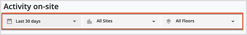
The Workplace Trends dashboard displays data about your workplace over set periods of time, sites, and floors that you determine. Use the
dropdown menus at the top of the dashboard to adjust the parameters of the data you want to see.
For more information on the dropdown menus and using reports, check out the
Working With Reports article.
Below the dropdown menus, you’ll see a variety of charts and graphs that provide you with information about your workplace. The available charts include the Key metrics, Percentage of capacity, Employees on- site, Average daily bookings, No-show rate, Failed Safeguard, Attendance Heat Map, Daily bookable desk utilization vs. capacity, and Average daily attendance.
To view more information on the data displayed and the calculations used to generate a metric, you can hover over the
tool tip for that graph or chart.
Your Workplaces, at a Glance
The Workplace Trends dashboard provides you with key metrics about your various sites. These metrics are a quick overview of your workspaces with critical data available at a glance. You can easily identify the number of sites, the number of associated employees, the number of active desks, the sharing ratio, and your office density using these metrics. The key metrics will not be affected if parameters are changed using the dropdown menus.
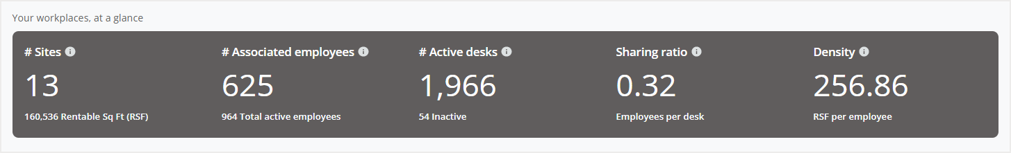
Associated Employees
An associated employee is an active employee that is associated with a site. An employee is considered to be associated with a site if the employee is assigned to the site. To learn more on adjusting or viewing an employee’s assigned site, check out the
Planning Reports article.
Any employees that do not have an assigned site will still be considered an associated employee if they have an assigned desk at a site or have occupant booking restrictions at a site.
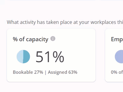
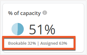
Percentage of Capacity
The Percentage of capacity pie chart gives you an overview of your occupancy during the time period selected. This chart calculates the percentage of capacity based on the number of occupied desks during the total amount of operating days selected. Below the chart, you will also see the
percentages for Bookable desks and Assigned desks.
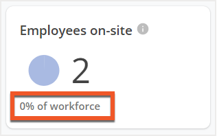
Employees On-Site
The Employees on-site metric lets you know how many employees have activity that indicates that they went on-site during the time period selected. Any employee that booked a desk, completed a Safeguard form, or had a badge event occur (if you’ve imported badge data) at least once over the time frame will be counted in this metric.
You are also able to view the number of employees on-site as an approximate percentage of your total workforce (the number of associated employees at selected sites) in the text below. If you've
imported badge data then it will be counted as part of this metric.
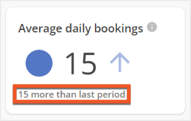
Average Daily Bookings
The Average daily bookings metric calculates the average number of bookings your workplace has each day over the selected time period. Text below the average daily bookings number compares the average daily bookings from the previous period to the current one.
You can use this information to help you understand trends at the highest level and monitor overall bookings across your workplaces.
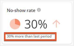
No-Show Rate
The No-show rate data allows you to see how many of your bookings were canceled on the same day that the booking was made for. This metric includes failed Safeguard submissions as cancellations. Below the No-show rate is a
comparison between it and the rate from the previous period.
This comparison can be used to help you identify why there is an increase in cancellations and take steps toward more completed bookings.
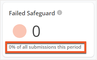
Failed Safeguard
The Failed Safeguard metric displays the total number of failed Safeguard forms over the selected time period. You will also see the total number of Safeguard submissions that failed,
expressed as a percentage. The Failed Safeguard metric can only be viewed by Admins.
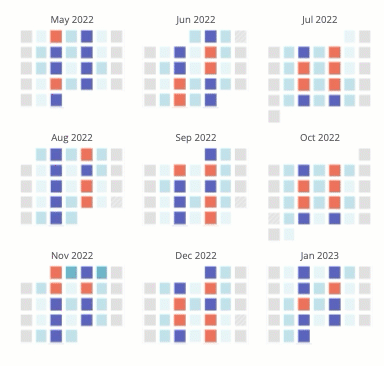
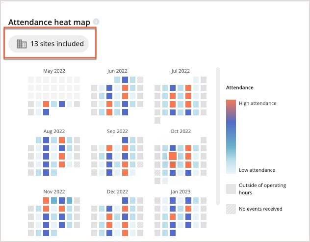
Attendance Heat Map
The Attendance Heat Map uses your
badge data to identify trends in your office attendance and determine when specific sites are busy. Using the heat map, you view the number of office visits each day at your sites over a month long period.
OverviewDaily Data ViewExported Data
Overview
Using the legend to the right of the heat map, you can compare the corresponding colors for each day and determine the level of attendance at the site. Hover over or select a specific day on the heat map to drill down on the attendance data for that day.
To the right of the heat map, you'll find the Export option, which allows you to download an Excel spreadsheet containing more detailed data on your office attendance, including the number of desks, badge swipes, number of bookings, peak number of bookings per day, and more.
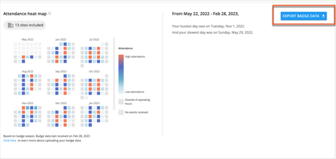
You can see more details for a specific date by choosing it from the calendar in the heat map.
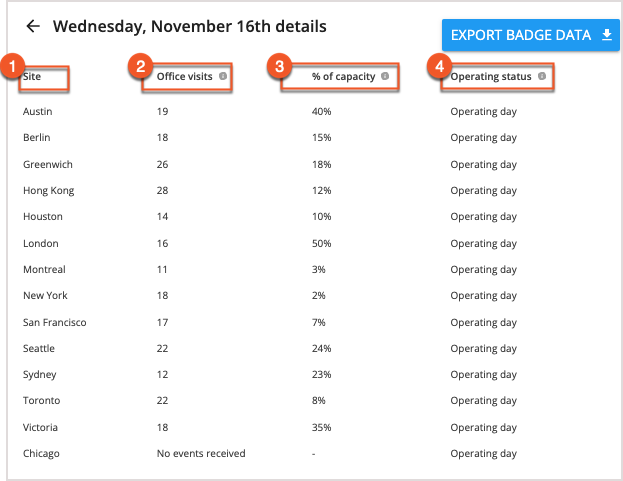
Daily Data View
After you've chosen a date, the daily data view on the right will populate with the
site name (1),
total number of visits (2),
the number of swipes in relation to percentage of capacity (3), and
whether that site was within operating hours on the selected day (4).
Above the heat map, you can also find the number of sites that have been included. If you select the sites included button, the Badge data detail screen will open. Here, you can compare the number of operating days with badge data to the total number of operating days in the selected date range, giving you an understanding of how complete your badge data is. With this information, you can then reach out to individuals at sites where data is incomplete, and gain a more complete picture of badge events and attendance across your organization.
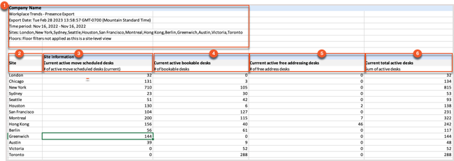
Exported Data
Exporting your data from the Badge Heat Map is a great way to see even more detail about badge swipes in your organization. The report includes the columns and explanations listed in the table below:
|
Column Name
|
Column Explanation
|
|
Site
|
The site that the badge data was pulled from
|
|
Current active move scheduled desks
|
The number of active desks scheduled for a move
|
|
Current active bookable desks
|
The number of available bookable desks
|
|
Current active free addressing desks
|
The number of available free addressing desks
|
|
Current total active desks
|
The sum of all active desks
|
|
Number of employees on site
|
The number of unique employees who swiped a badge, booked a desk, or filled out a Safeguard assessment
|
|
Total number of office visits
|
The number of unique daily employee visits.
|
|
Total number of bookings
|
The number of unique employees who booked desks.
|
|
Total number of safeguard submissions
|
The number of unique employees who submitted a Safeguard assessment.
|
|
Number of unique employees on site without a booking
|
The number of unique employees who badged in without a booking,
|
|
Peak attendance
|
The max number of office visits (badge events only) on single day.
|
|
Peak attendance date
|
The date on which peak attendance was achieved.
|
The exported data is divided into two halves in the spreadsheet, Site Information and Overall Attendance.
Site Information
The site information section of the report includes your
Report Data (1), indicating your company name, the export date, the time period selected, the sites included, and any floor filters applied to the report. Underneath this, you'll see your data broken down by
Site (2). You can review your counts of
Current active move scheduled desks (3),
Current active bookable desks (4),
Current active free addressing desks (5), and
Current total active desks (6) for each site in your organization.
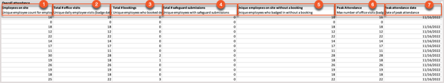
Overall Attendance
The Overall Attendance section of the report provides you with a breakdown of badging events across your organization, broken down on a per-site basis. It includes the Number of employees on site (1), Total number of office visits (2), Total number of bookings (3), Total number of safeguard submissions (4), the Number of unique employees on site without a booking (5), the Peak attendance (6) over the period selected, and the Peak attendance date (7).
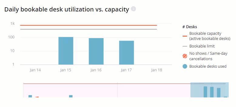
Daily Bookable Desk Utilization vs. Capacity
The Daily bookable desk utilization vs. capacity graph compares desk utilization to the total bookable limit and overall bookable capacity of your sites for each day.
Using the graph, you can see the number of desks booked and the number of desks with same-day cancellations for each day, and view how closely that utilization approaches your bookable limit and bookable capacity.
Using this metric, you can determine whether you need to increase or decrease your total number of bookable desks.
The time frame for the data shown in the Daily bookable desk utilization vs. capacity chart is adjustable by using the scrollable chart below the graph. You are able to change the length of time period, as well as adjust which days are shown in the chart.
Expand or shorten the
blue selection tool to increase or decrease the length of time shown in the graph. You can also move the blue selection tool along the chart to focus on a different selection of days.
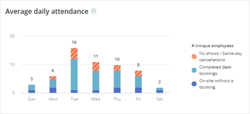
Average Daily Attendance
The Average daily attendance graph shows you the average number of employees that came into the office each weekday. For each day, you see the average number of unique employees that were on-site without a booking, had a completed desk booking, or made a booking that was canceled on the same day. Employees without completed bookings are considered to have been on-site if they have either one of the following:
- A passing Safeguard result for that day
- A badge event that day, if you've imported badge data
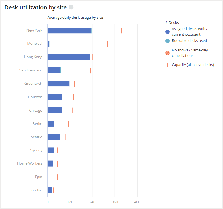
Desk Utilization by Site
The Desk utilization by site graph allows you to view how your desks are utilized across all your sites and compare the average daily desk usage. The graph shows the number of Assigned desks with a current occupant, Bookable desks, and No-show desks utilized in each site and visually represents the total number of average desks used daily against the total capacity of the site.
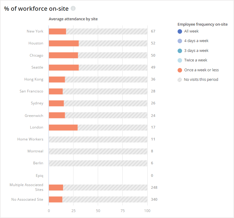
Percentage of Workforce On-Site
The Percentage of workforce on-site chart gives you insight into what percentage of employees were on-site during the selected period. All sites are compared in this chart. To the right of the chart, you will see a legend that explains what each color of the chart represents. You will be able to compare the percentage of employees who did not visit during the period, who visited on average once a week, twice a week, three days a week, four days a week, and all week long.
Employees with multiple associated sites or no associated site will be included in the respective percentages at the bottom of the chart.
As a reminder, employees are considered on-site for each day they have a desk booking or completed Safeguard. Badge events will also be considered if you've imported
badge data.