Please note that your subscription plan determines the specific set of features available to you, which may result in differences between what you see and the images presented in this article. For further details on the features included in your plan, please contact your OfficeSpace Admin.
With the Room Booking Trends Dashboard in
Insights Hub, you can see data and trends related to room booking over a specific period of time. The dashboard shows you patterns in the types of spaces that are booked, the timing of those bookings, and their frequency.
OverviewKey MetricsTrend Information
Overview
The Overview area of the Room Booking Trends Dashboard provides an overview of
key metrics surrounding room booking (1). Each metric also provides a comparison between the current period and the previous period.
You can choose a specific time period, site, floor, and department by using the
picker menus (2) along the top of the dashboard, much like the other dashboards in
Insights Hub. The
download button (3) allows you to download the raw data used in the calculation by the dashboard, in CSV format. This raw data is a list of all of the room bookings that were scheduled to take place over the period, including those that were canceled.
Key Metrics
Overall Utilization
This metric shows you how much your bookable rooms have been used over the time period selected. It is calculated as
Minutes Used, which is the total duration of the meetings that took place over the period, divided by the
Minutes Available, which is the total amount of time that was available to be booked across the selected rooms, according to your operating hours.
Peak Daily Utilization
This is the maximum level of utilization that was reached on an individual day over your specified time period.
Reclaimed Time
This metric represents the total number of minutes that have been rebooked as "just-in-time" meetings, after a previous booking has been released before the scheduled end time, over your chosen period.
Note that this metric will only show if you have enabled check-in via your Room Booking settings.
Hybrid Meetings
If check-in is not enabled in your Room Booking settings, you will instead see this metric, which is a count of the number of meetings with a video conferencing link that took place over your chosen period.
Underutilized Rooms
This metric displays the number of rooms that had less than 15% utilization over your specified time period.
Trend Information
With the interactive graphs in the Trend Information area of the Dashboard, you can view the data for
bookable room counts (1), the
fit between room sizes and meeting sizes (2), the
most used spaces and their usage (3), the
busiest booking hours (4), and
room usage (5).
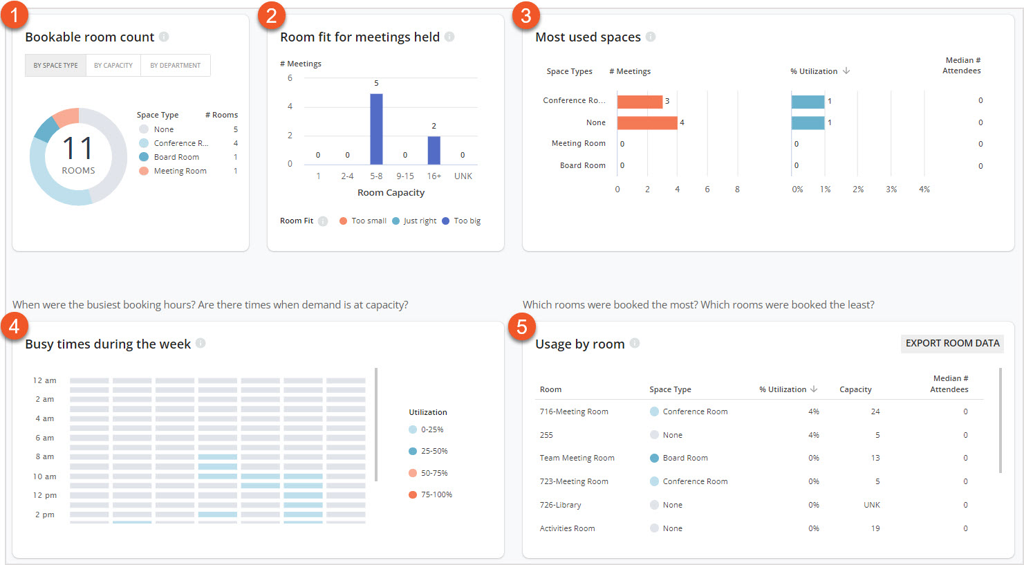
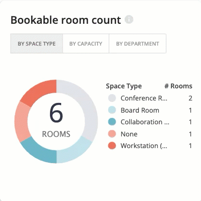
Bookable Room Count
The Bookable room count chart breaks down the available bookable rooms in the selected area by Space Type, Capacity, and Department. This chart includes all rooms that are linked via your
calendar integration. You can switch between these views by using the
view buttons along the top of the panel.
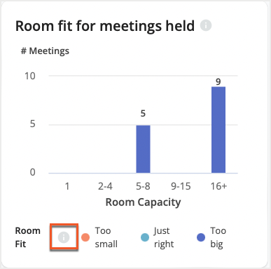
Room Fit For Meetings Held
The Room fit for meetings held chart allows you to understand how frequently rooms of different sizes are being booked, and how many of those meetings were in rooms that were too large or too small for the number of people who attended the meeting
in person.
Using this data, you can determine whether or not you have an appropriate distribution of room sizes in the area, in line with the size of meetings that people usually book. A guide to the sizes for meetings can be found by hovering over the
tooltip on the chart.
In-Person Attendees
When interpreting the data, the chart considers an in-person attendee to be someone who meets at least one of the following criteria:
- Has completed a desk booking at the site where the meeting was held, on the day of the room booking
- Has passed a Safeguard result for the site where the meeting was held, on the day of the room booking
- Has a badge-related event at the site where the meeting was held, on the day of the room booking, if you've imported badge data.
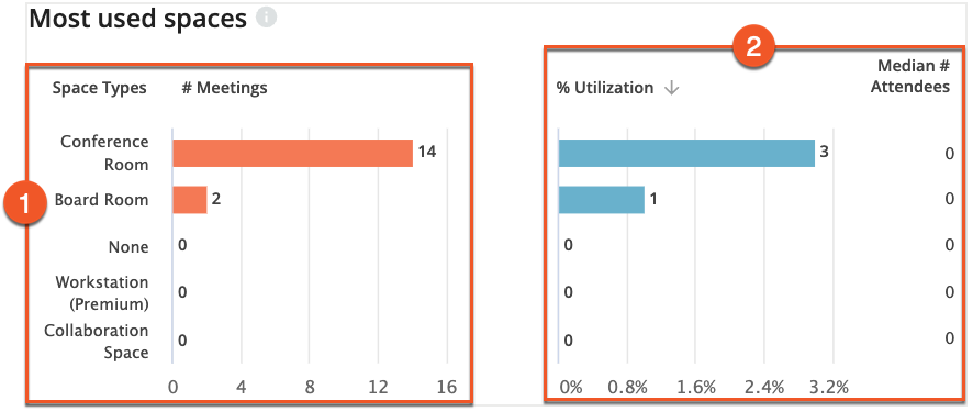
Most Used Spaces
The Most used spaces panel tells you which types of rooms were booked the most, and how often. The
first chart (1) tells you the number of meetings that took place in rooms with that Space Type. The
second chart (2) tells you the utilization of each Space Type, which is the number of minutes booked in rooms with that Space Type, divided by the number of minutes that were available across all those rooms.
Busy Times During the Week
The
Busy times during the week chart (1) allows you to see which days of the week are busiest for the period of time that you've selected. It displays days of the week in each column, and hours of the day in each row.
Each block is colored according to the
Utilization legend (2), letting you know how often rooms were booked during a specific time period.
In the example below, the average utilization was around 8% on Tuesdays at 9am. This means that spaces that were available at 9am on Tuesdays were booked around 8% of the time.
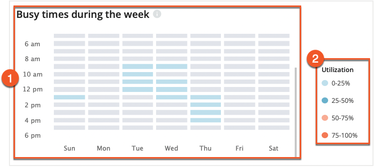
You can see the details of utilization in a specific window of time by hovering over that block in the graph.
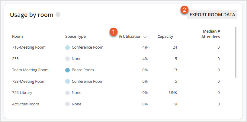
Usage by Room
Usage by room allows you to see how often each room was booked. You can also see the exact percentage of utilization, the room’s capacity, and the median number of attendees for each room.
To sort between the most used and least used rooms, click on the % Utilization (1) column.
Select Export Room Data (2) to download an Excel spreadsheet, where you can find information such as capacity, utilization metrics, total minutes booked, number of meetings over the selected timeframe, the average duration, and the median number of attendees for each of your rooms.